Future Dusk: WGSN's Official Color of the Year 2025
Experience the luxurious transformation Future Dusk brings to intimate spaces as WGSN's official 2025 Color of the Year while discovering perfect furniture pairings from Grand Goldman's exclusive collection
5/21/20254 min read
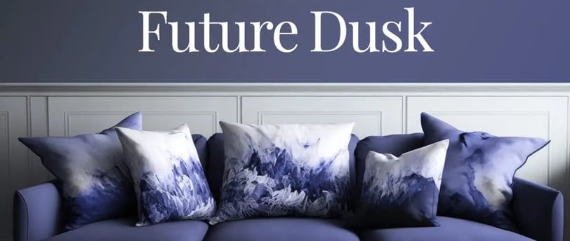
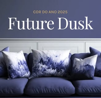
In the ever-evolving world of interior design, color trends come and go, but some make such a profound impact that they transform how we think about our spaces entirely. WGSN, the world's leading consumer trend forecaster for the past 25 years, has officially announced Future Dusk as its 2025 Color of the Year, in partnership with Coloro. This deep, moody hue sits distinctively between blue and purple - creating a color that offers a sense of mystery and intrigue while feeling simultaneously forward-thinking and sophisticated.
Understanding Future Dusk: The Color That Defines 2025
Future Dusk represents a distinct departure from the earthy hues and soft neutrals that have dominated recent design trends. Unlike these safer options, this bold color presents a mysterious depth that adds dramatic character to any space. Design forecasters at WGSN attribute its rise to several cultural factors:
The growing preference for colors that perform well in both digital and physical environments
Our societal yearning for colors that create immersive, emotionally resonant spaces
The shift toward more intimate, cocooning environments in our homes
The move away from stark minimalism toward nuanced, layered atmospheres
This versatile hue serves as both an excellent foundation color for intimate spaces and a sophisticated accent throughout the home, making it accessible for designers and homeowners at all levels of design confidence.
Perfect Spaces for Future Dusk
According to design experts, Future Dusk truly excels in smaller, more intimate spaces:
Studies and Home Offices: The color creates a focused, thoughtful atmosphere perfect for concentration
Media Rooms: The deep blue-purple tones enhance viewing experiences by reducing visual distractions
Bedrooms: Creates a cocooning effect that promotes relaxation and sleep
Reading Nooks: Establishes a sense of sanctuary in dedicated quiet spaces
Bathrooms: Adds unexpected luxury and sophistication to self-care spaces
The Art of Contrast: Personalizing with Unexpected Elements
While Future Dusk creates a sophisticated backdrop, truly memorable spaces incorporate unexpected elements that reflect personality and prevent designs from feeling overly curated. This is where the art of thoughtful contrast comes into play.
Contemporary Art with Personality
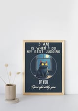
One of the most refreshing interior trends of 2025 is the movement away from overly serious art toward pieces that spark joy and conversation. Minimalist wall art featuring witty pet memes has emerged as a surprising counterpoint to the sophisticated Future Dusk palette. These pieces work particularly well because:
The minimalist framing and presentation maintain design integrity while the content adds personality
The unexpectedness creates memorable focal points
The humorous elements soften spaces that might otherwise feel too formal
They provide genuine conversation starters in social areas
When selecting such art pieces, look for clean, simple frames that don't compete with the Future Dusk elements in your space. White, thin-framed pieces or those with subtle brass detailing tend to work best, allowing the humorous content to make its statement without creating visual clutter.
Styling Tips for Future Dusk Success
To help you incorporate Future Dusk most effectively, consider these designer-approved strategies based on WGSN's color analysis:
For Intimate Spaces
In studies, media rooms, and bedrooms where Future Dusk truly excels:
Apply the color to all walls for a fully immersive experience that creates depth and focus
Pair with adequate lighting that highlights the color's complexity rather than making the space feel dark
Use textural elements like velvet, bouclé, or silk in complementary tones to enhance the sensory richness
Consider ceiling application for an especially dramatic effect in media rooms
For Accent Applications
If painting entire walls feels too committed:
Use Future Dusk for cabinetry, built-ins, or furniture pieces as Wattyl suggests
Incorporate through textiles like bed linens, towels, and drapery
Apply as an accent wall behind key furniture pieces
Use in tile selections for bathrooms or kitchen backsplashes
For Color Combinations
Future Dusk shows remarkable versatility in color pairings:
With warm tones: Pair with orange, red, or mustard for dramatic contrast
With cool tones: Combine with emerald green or teal for sophisticated depth
With neutrals: Balance with warm whites or soft beiges to prevent the space from feeling too dark
With metallics: Grand Goldman's Brass and Gold Accents specifically enhance Future Dusk's luxurious quality
Looking Forward: Why Future Dusk Has Staying Power
Unlike some trend colors that quickly feel dated, design forecasters predict Future Dusk will have remarkable longevity. Its complex undertones allow it to evolve with changing design directions, and its ability to pair with both warm and cool complementary colors gives it unusual versatility.
As we continue through 2025 and beyond, expect to see Future Dusk evolve from a trending color to a new contemporary neutral—one that will define this design era while continuing to offer fresh possibilities for creative expression in our homes and commercial spaces.
Ready to transform your space with Future Dusk? Visit Grand Goldman to explore their curated collection of elegant furniture and decor pieces.
Use Referral LInk: https://grandgoldman.com/?ref=iglldvyj to get 10% off, and also use coupon code PIVOTPOINTDESIGN to receive a 5% discount on every purchase.
This post contains referral and affiliate links. If you purchase through these links, we receive a small commission at no additional cost to you


Links
Follow us on social media
alleatorika@proton.me
Contact information:
© 2025. All rights reserved.